A Big Update for ParseGreek is in the Works! Here is What You Can Expect
Today marks the three year anniversary since the release of my first App ParseGreek for iOS. I followed it up later with the Android release, and followed later by FlashGreek. I've been so pleased with how it was received and continues to be received. It currently has 14 five★ rating on the Android store (average is 4.2), and 14 five★ reviews on iTunes (average 4.5).
ParseGreek is near and dear to my heart because it was my first foray into being an entrepreneur, and combining two of my skill sets: Biblical studies and Technology. I've learned a lot of things along the way and will continue to do so. And it has certainly helped that ParseGreek has created another small stream of income for me and my family.
ParseGreek will continue to move forward and with this blog post I'm happy to announce that version 2 of ParseGreek is actively being worked on as we speak. In addition to telling you about some of the new things that are in the pipeline, as well as the new interface, I would also invite any of you to put in the comments any questions, critiques, or update requests that you would like to see in ParseGreek's future.
The Set Up Screen
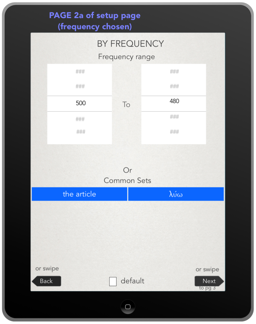
ParseGreek's current setup screen is functional, but pretty ugly :-) Version 2 of ParseGreek will have a revamped, multipage setup screen for users:
As you can see, a single page has turned into 3 pages that can quickly be swiped through (image 2 and 3 above would be the second page, depending on the choice you make on page 1). At the bottom of each page is a "default" check box. So, if you are always studying be frequency, checking that as the default means the startup of the app will bring you to page 2 rather than page 1. I am also considering right now including a few more full set words (like λυω and the article on page 2 of the setup). If I do this, I will choose full paradigms of some of the highest frequency words. If you have some thoughts on this, I am eager to hear about them in the comments below.
Page 3 is where some new features will also be added. Currently, word types can be narrowed down to one of five options. I have added a sixth option (pronouns), and we will add the ability to choose multiple options.
One of the most frequent suggestions (for both ParseGreek and FlashGreek) is having the ability to effectively ignore words that you always get correct. The next version of ParseGreek will keep a count of how often words have been answered correctly. You can then use this information to tailor your quiz. So you will be able to tell ParseGreek "don't include words I've answered correctly 5 times."
Finally, in the new set up screen you will also be able to restrict the quiz to a certain number of test words. Another frequent gripe was that the quizzes could end up being too massive to actually finish. This will allow you to make smaller random quizzes of, say, only 25 words — even if the previous criteria you chose resulted in 75 words.
The Quiz Screen
After talking with some designer friends and getting some crowd-sourced twitter feedback, I'm very happy with the new look of the ParseGreek quiz screen. Here are 3 shots (participle example, verb example, noun example).
As you can see, ParseGreek will have a new look and color scheme. It still has the same feel, but I've moved several things around to give even more space for larger buttons. A few of the changes above are:
- The correct/incorrect count is now in the top right corner
- The hint button is now a direct tap on the word itself
- The space for the word definition is now the entire bottom left corner
- The Check and the Next buttons are now a combined single button that is larger.
So that's it! My baby is growing up and continuing to evolve. Thanks to all of you who have purchased and made use of ParseGreek. If you have any other suggestions or feedback on what you've read in this post, or anything else you'd like to see in ParseGreek, let it fly in the comments!


